
What Does Good Nonprofit Web Design Look Like?
Nonprofit web design is about more than making an organization look professional online.
A good nonprofit website should quickly communicate what the organization does, build trust, make it easy for people to take action, and help visitors understand the impact of their support. Whether the goal is to attract donors, recruit volunteers, provide services, or raise awareness, the website should make the next step obvious.
For nonprofits, this matters because the website is often the first interaction someone has with the organization.
A well-designed site can strengthen credibility and make supporters more comfortable engaging with the cause.
A poorly designed one can create confusion, undermine trust, and make even the most compelling mission difficult to understand.
So, what makes a good nonprofit website?
1. It Clearly Communicates the Mission
Visitors shouldn’t have to dig through an About page to understand what your nonprofit does.
Within seconds of landing on the homepage, people should be able to answer three basic questions:
- What does this organization do?
- Who does it help?
- Why does it matter?
Your homepage should communicate your mission in clear, straightforward language. Avoid leading with vague statements or internal terminology that may make sense to your team but not to a first-time visitor.
Featured Nonprofit Website: charity: water
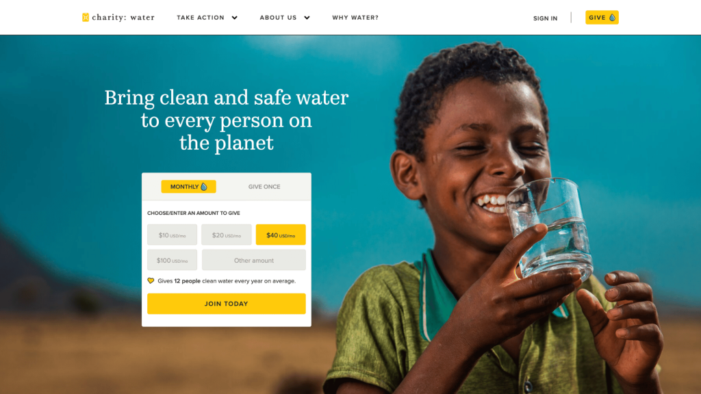
Charity: water does this particularly well. Its website immediately communicates its focus on bringing clean and safe drinking water to people around the world, while its imagery and calls to action reinforce the mission throughout the homepage.
The result is a website where visitors don’t have to figure out what the organization does. The mission is immediately visible, understandable, and connected to a clear opportunity to take action.
The goal of effective nonprofit web design is to make your mission impossible to misunderstand.
2. It Makes the Most Important Actions Obvious
A nonprofit website isn’t simply an online brochure. It should help visitors take action.
Depending on your organization, those actions might include:
- Donate
- Volunteer
- Become a member
- Find services
- Register for an event
- Sign up for updates
- Advocate for an issue
- Contact the organization
These actions should be visually prominent and consistently placed throughout the site.
Your primary CTA should also use specific language.
“Submit” is less compelling than “Donate Now.”
“Learn More” is less useful than “Find Food Near You.”
Featured Nonprofit Website: Habitat for Humanity
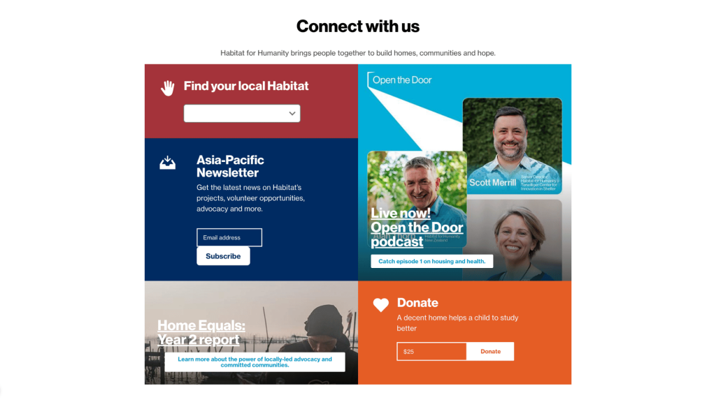
Habitat for Humanity does this well by giving visitors clear pathways to Donate, Volunteer, Find a Habitat, and Get Involved.
These actions are prominent throughout the website, helping different types of visitors quickly identify how they can participate.
The important point is that not every visitor has the same goal. Good nonprofit web design anticipates those different needs and makes the relevant next step obvious.
Don’t make visitors figure out how to help. Show them.
3. It Uses a Simple, Intuitive Navigation
Good navigation shouldn’t require instructions.
Visitors should be able to move around your website naturally and understand where each menu item will take them. Keep navigation labels short and familiar, and avoid organizing your site according to your internal organizational structure.
For example, visitors are more likely to understand:
What We Do | Get Involved | About Us | Resources | Donate
Rather than:
Programs | Development | Organizational Information | Engagement Opportunities
A good rule is to organize your navigation around what your audiences need, not how your staff thinks about the organization.
Clear navigation also helps visitors find important information quickly. Research and guidance on nonprofit web design consistently emphasize intuitive navigation as a fundamental part of usability.
Featured Nonprofit Website: American Red Cross
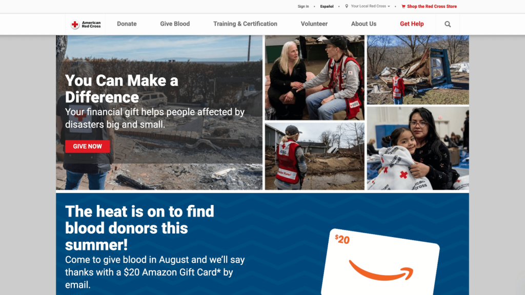
American Red Cross has an unusually broad range of audiences and services, but its website makes those paths easy to identify. Visitors can quickly find emergency assistance, shelters, blood donation, training, preparedness information, and ways to donate or get involved.
Takeaway: Even a large nonprofit with a complicated organization can make its website feel straightforward.
4. It Puts the People and Mission at the Center
Nonprofit websites should feel human.
Stock photography, generic corporate language, and walls of institutional copy can make an organization feel distant from the people it serves.
Strong nonprofit design uses photography, video, testimonials, stories, and other visual elements to show the people behind the mission.
This doesn’t mean exploiting people’s stories for emotional impact.
It means using authentic, respectful storytelling to help visitors understand the real-world importance of the organization’s work.
Featured Nonprofit Website: St. Jude Children’s Research Hospital
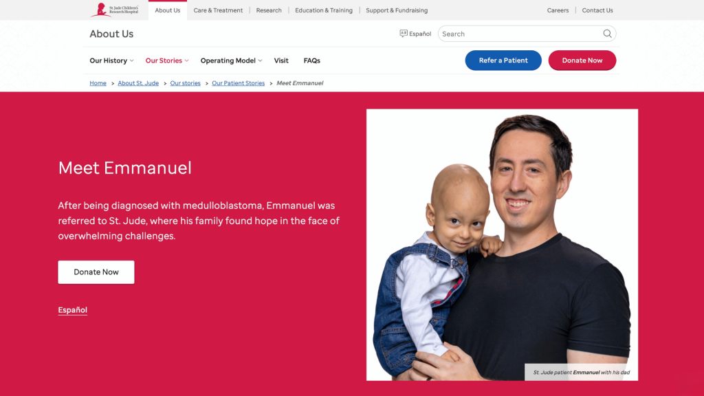
St. Jude’s website combines its mission with personal stories from patients and families. Its homepage currently features stories from children and families alongside information about its research and medical work.
This creates a balance between the human impact of the mission and the expertise behind the work.
5. It Shows Impact, Not Just Activity
Saying “we help thousands of people” is less convincing than showing the thousands of people that you’ve helped and how you’ve impacted their lives.
A good nonprofit website should demonstrate impact through:
- Statistics
- Stories
- Case studies
- Photos and video
- Program results
- Annual reports
- Research
- Testimonials
- Maps or other visualizations
The goal is to answer the question every supporter eventually asks, “What difference does my support make?”
Featured Nonprofit Website: World Wildlife Fund (WWF)
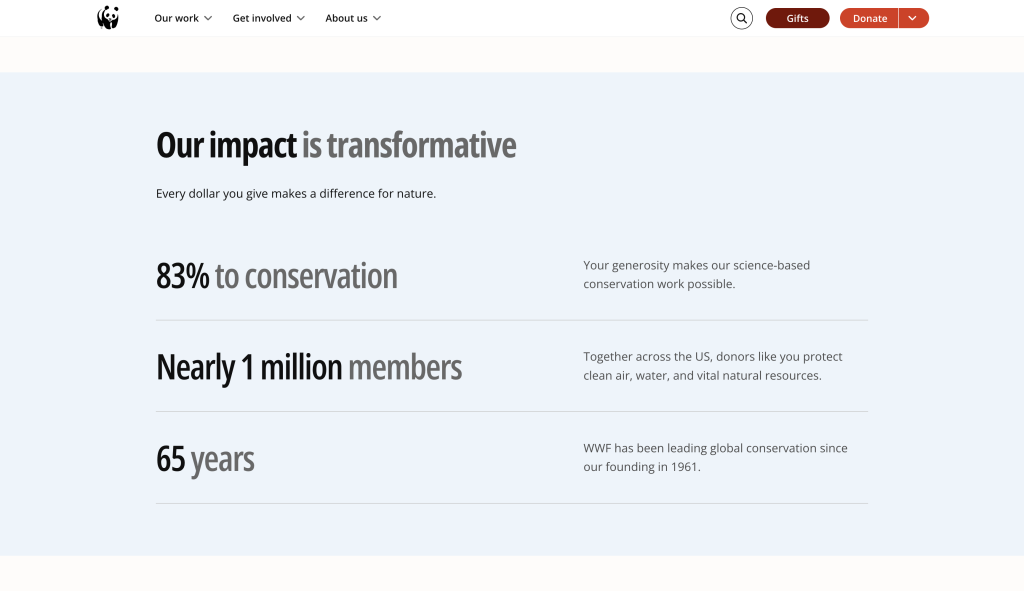
World Wildlife Fund does a strong job of connecting its work to measurable conservation outcomes. Its website highlights specific species, conservation initiatives, and the progress being made to protect wildlife and natural habitats.
Rather than simply saying it works to protect the planet, WWF gives visitors concrete examples of what it’s protecting, where it’s working, and why the work matters.
For nonprofits, the lesson is simple: don’t just tell visitors about your mission. Show them what your mission accomplishes.
6. It Builds Trust Through Transparency
Trust is particularly important for nonprofits.
A visitor considering a donation, partnership, membership, or volunteer opportunity needs to feel confident that the organization is legitimate, responsible, and transparent.
Your website should make important information easy to find, including:
- Who runs the organization
- Contact information
- Financial information
- Annual reports
- Program information
- Privacy policies
- Donation information
- Relevant certifications or affiliations
Transparency shouldn’t be buried somewhere in the footer.
Featured Nonprofit Website: Doctors Without Borders (MSF)
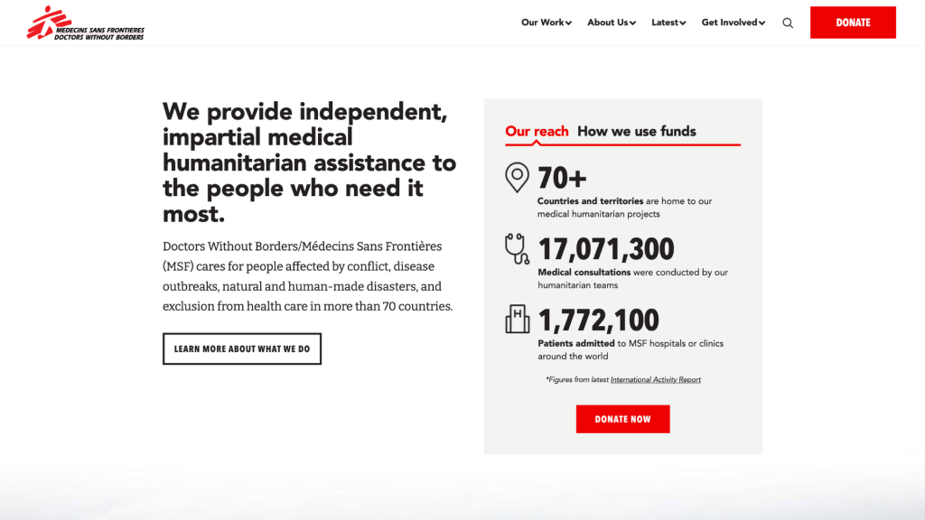
Doctors Without Borders (MSF) provides visitors with substantial information about its humanitarian work, finances, and organizational operations. Its website connects stories from the field with information about how the organization is funded and how it operates.
This helps visitors understand not only what MSF does, but how it does it and how it uses the support it receives.
For nonprofits, transparency is more than an organizational requirement. It’s a design decision: make the information people need to trust you easy to find.
7. It Has Strong, Consistent Visual Design
A professional nonprofit website doesn’t necessarily need an elaborate design.
What matters more is consistency.
Your logo, colors, typography, photography, buttons, icons, and other visual elements should work together to create a recognizable identity.
A consistent design helps visitors understand that they’re still interacting with the same organization as they move between pages. It can also reinforce credibility and make the organization feel established and trustworthy.
Featured Nonprofit Website: UNICEF
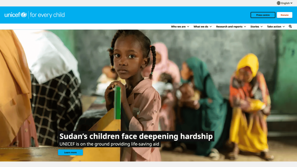
UNICEF demonstrates the value of strong brand consistency across a large global organization. Its website uses recognizable UNICEF branding while presenting information, stories, programs, and opportunities to take action across different audiences and countries.
The lesson for smaller nonprofits is simple. You don’t need a huge design budget to create a consistent visual identity.
8. It Uses High-Quality, Authentic Photography
Images are one of the fastest ways to communicate emotion, context, and impact.
For nonprofits, photography can help visitors see the people, communities, places, and work behind the mission.
Whenever possible, use original photography from your programs, events, volunteers, staff, and community. Authentic images generally communicate more than generic stock photography.
But good nonprofit photography also requires care. Images should respect the dignity and privacy of the people being photographed, particularly when working with children, vulnerable populations, or people receiving services.
Featured Nonprofit Website: World Central Kitchen
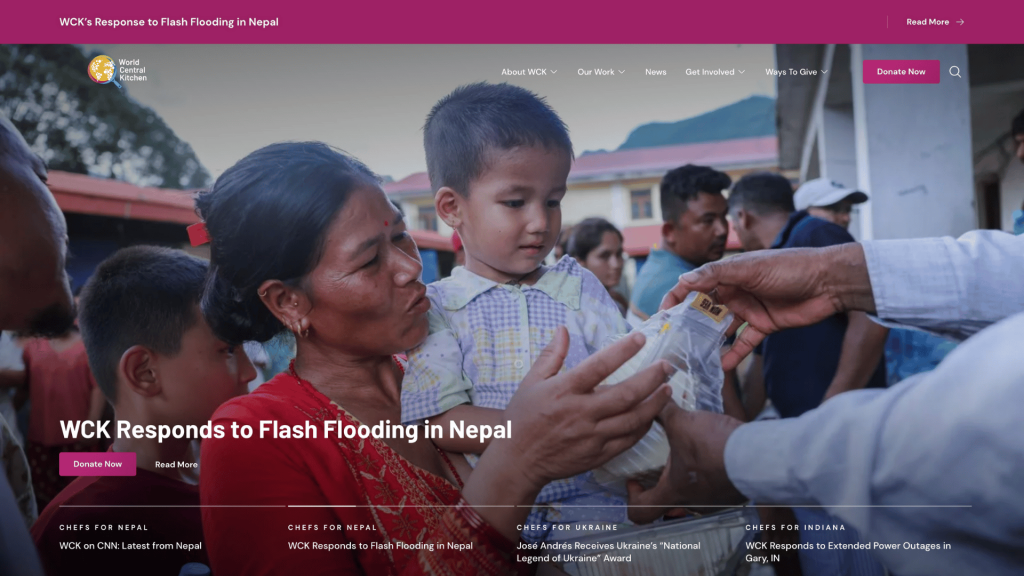
World Central Kitchen is a strong example of using photography to tell its story. Its website prominently features images of chefs, volunteers, communities, and meals being prepared and delivered during humanitarian and disaster-relief efforts.
The photography helps visitors understand the organization’s work at a glance. You can see the people involved, the communities being served, and the scale of the response without having to read a lengthy explanation.
For nonprofits, the takeaway is simple: don’t use images just to decorate your website. Use them to tell your story.
9. It Is Designed for Mobile Devices
A nonprofit website needs to work just as well on a phone as it does on a desktop.
Visitors may discover your organization through a social media post, search result, email, QR code, or shared link, all of which can lead directly to your website from a mobile device.
That means mobile design should influence decisions about:
- Font sizes
- Navigation
- Buttons
- Forms
- Images
- Page layouts
- Donation flows
- Content length
Responsive design is now standard, but simply making a desktop website “shrink” onto a phone isn’t enough. Mobile visitors should be able to complete important actions comfortably.
Featured Nonprofit Website: Khan Academy
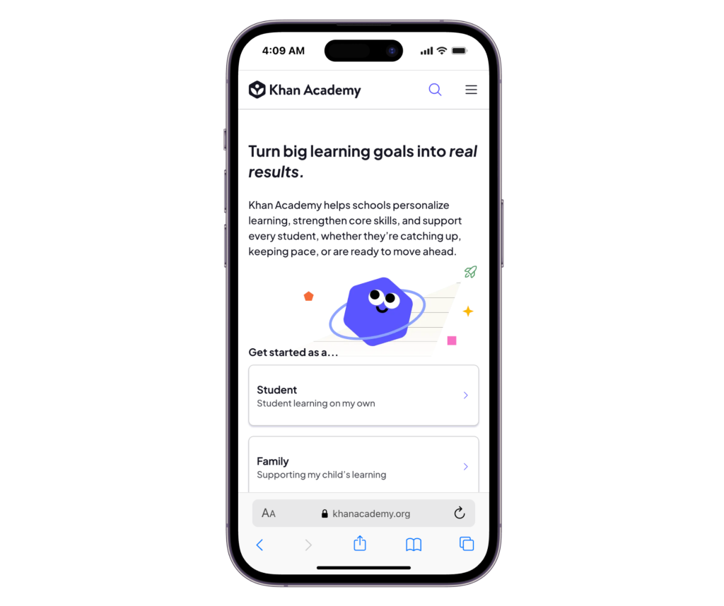
Khan Academy is a strong example of designing an experience around how people actually use the platform. Its website provides access to lessons, exercises, and learning resources across devices, with a clean interface that keeps navigation and core actions relatively straightforward.
This is particularly important for an educational nonprofit serving learners who may access its resources from a wide range of devices and environments.
The takeaway for nonprofits is simple. Don’t design your website for the device you happen to be using. Design it for the people you’re trying to reach.
10. It Makes Content Easy to Scan
Most website visitors don’t read every word on a page.
They scan.
That means good nonprofit web design needs a clear visual hierarchy.
Use:
- Short paragraphs
- Descriptive headings
- Bulleted lists
- Pull quotes
- Statistics
- Images
- Clear CTAs
- Plenty of whitespace
Avoid presenting important information as enormous blocks of uninterrupted text.
A visitor should be able to scan a page and understand its main points before deciding whether to read further.
Good design doesn’t necessarily mean less information. It means better presentation of information.
Featured Nonprofit Website: The Nature Conservancy
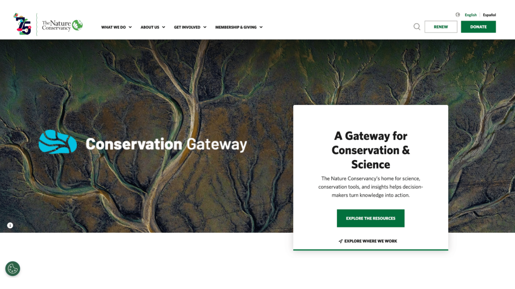
The Nature Conservancy provides a good example of structuring a large amount of information without overwhelming visitors. Its website covers conservation, climate change, science, locations, projects, and ways to get involved, but content is organized into clearly defined sections that make it easier to navigate and scan.
Rather than presenting visitors with walls of text, the site uses headings, imagery, short content blocks, statistics, and clear links to guide people through complex subjects.
The lesson for nonprofits is straightforward: you don’t have to say less. You just need to make what you say easier to find and understand.
11. It Makes Giving Easy
If donations are an important part of your nonprofit’s fundraising strategy, the giving experience deserves special attention.
Your donate button should be easy to find. The donation form itself should also be straightforward, mobile-friendly, secure, and free of unnecessary steps.
Consider offering:
- One-time donations
- Monthly giving
- Suggested donation amounts
- Multiple payment methods
- Matching gift information
- Clear explanations of where donations go
Your website is no good if someone decides to donate and then gives up because the process is complicated.
Featured Nonprofit Website: Save the Children
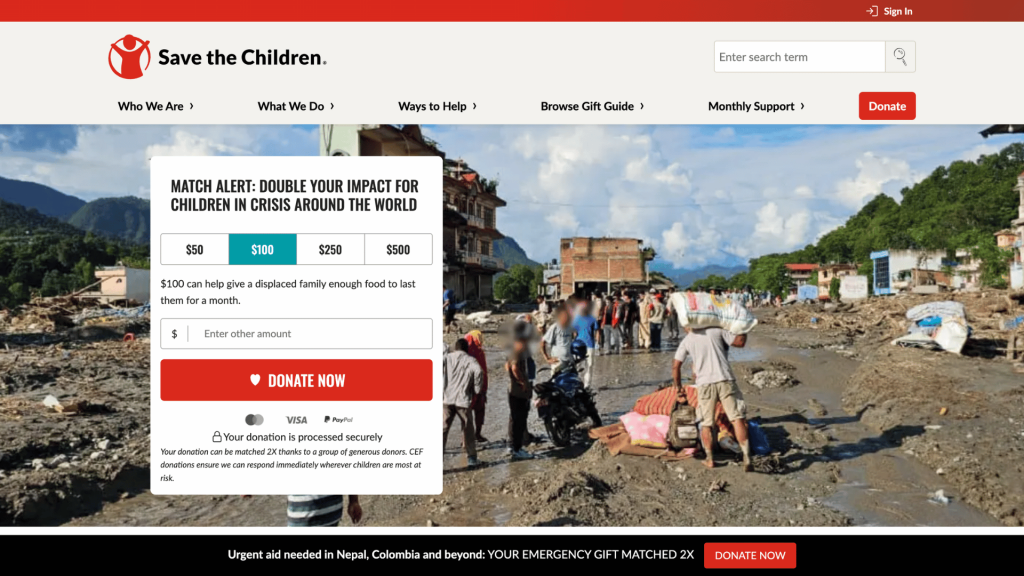
Save the Children makes giving a prominent part of its website experience. Visitors can quickly find donation options and choose how they want to support the organization’s work, while the giving experience keeps the focus on completing the donation rather than navigating through unnecessary information.
This is an important principle of nonprofit web design: once someone decides to give, don’t give them a reason to change their mind.
A great donation page doesn’t need to be complicated. It needs to be clear, trustworthy, and easy to complete.
12. It Gives Visitors More Than One Way to Get Involved
Not everyone who visits your website is there to donate.
Some people may want to volunteer. Others may want to attend an event, subscribe to your newsletter, advocate for your cause, become a member, or simply learn more.
A good nonprofit website recognizes these different levels of engagement.
Featured Nonprofit Website: Feeding America
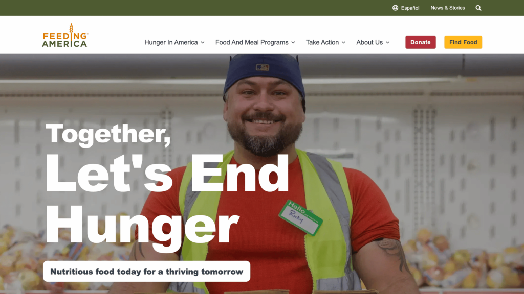
Feeding America gives visitors multiple ways to participate, including donating, advocating, fundraising, volunteering, and finding food or local resources.
Your website should give visitors a way to take the next step, not force everyone toward the same step.
13. It Makes Important Information Easy to Find
Good nonprofit web design isn’t just about donors.
Depending on your organization, visitors may come to your website because they need a service, want to contact someone, need information for a grant application, are looking for an event, or want to find a local program.
Think about the different audiences your website serves and identify the information each one needs most.
Featured Nonprofit Website: Planned Parenthood
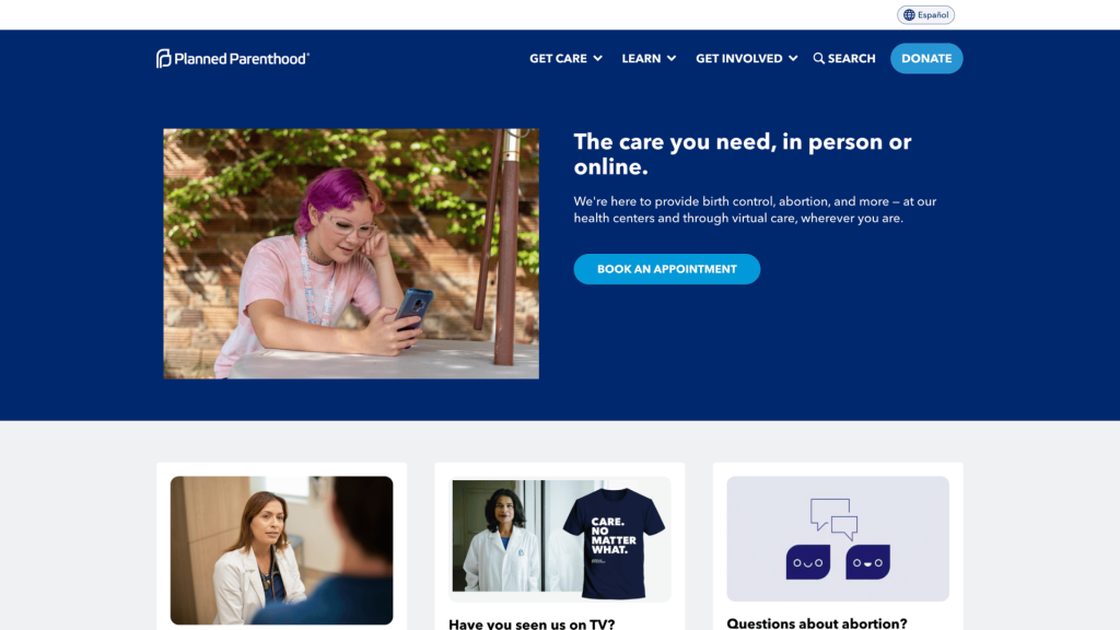
Planned Parenthood is a strong example of designing around user needs. Its website puts access to services and practical information prominently alongside educational resources and information about its organization.
Visitors can quickly identify pathways to find a health center, make an appointment, learn about health topics, or access resources without needing to understand how the organization itself is structured.
For nonprofits, the lesson is simple: your website should be organized around what your visitors need, not around how your organization is organized internally.
14. It Is Accessible to as Many People as Possible
Accessibility should be part of nonprofit web design from the beginning, not something added after launch.
Your website should consider visitors who use screen readers, keyboard navigation, captions, larger text, or other assistive technologies.
Good accessibility practices include:
- Sufficient color contrast
- Descriptive link text
- Alt text for meaningful images
- Keyboard-friendly navigation
- Proper heading structure
- Captions for video
- Forms with clear labels
- Readable font sizes
- Avoiding information conveyed through color alone
Accessibility also improves the experience for many people who don’t identify as having a disability.
Featured Nonprofit Website: Special Olympics
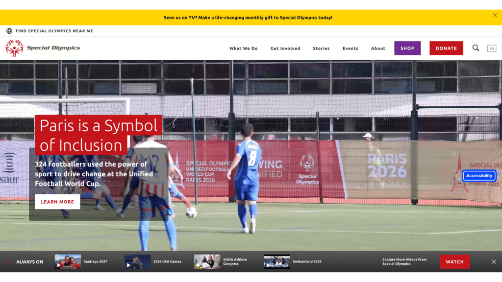
Special Olympics is particularly relevant because accessibility and inclusion are central to its mission. The organization provides Easy Read resources designed to make information easier to understand, including simplified language and visual elements. It also emphasizes accessibility across its digital content and resources.
Its approach demonstrates an important point: accessibility isn’t simply a technical feature of a website. It’s about designing information so that more people can actually use it.
Common Nonprofit Website Design Mistakes
Even organizations with strong missions can end up with websites that are difficult to use.
Some of the most common nonprofit website design mistakes include:
Making the homepage all about the organization
Visitors don’t necessarily care about your internal departments, history, or organizational structure. Start with what matters to them: what you do, who you help, and how they can get involved.
Hiding the Donate button
If fundraising is important to your organization, don’t make visitors search for the donation page.
Using too much jargon
Terms that are obvious to your staff may be confusing to donors, volunteers, journalists, or members of the public.
Cramming too much information onto every page
More content doesn’t automatically mean more useful content. Give important information room to breathe.
Using outdated or generic imagery
A nonprofit website filled with old event photos or generic stock photography can quickly feel disconnected from the organization’s current work.
Making visitors guess what to do next
Every important page should have a logical next step.
Ignoring mobile users
A website that works beautifully on a desktop but is frustrating on a phone is still a poorly designed website.
Treating accessibility as optional
Accessibility should be considered throughout the design process, not added as a last-minute fix.
Letting important information become buried
Annual reports, contact details, program information, financial information, and service resources should be easy to locate.
Designing a beautiful website that nobody can maintain
A website can look fantastic at launch and become outdated six months later if staff can’t easily update it.
This is one reason good nonprofit web design should consider not
only how a website looks today, but how the organization will manage it tomorrow.
So, What Makes a Good Nonprofit Website?
The best nonprofit websites aren’t necessarily the ones with the most impressive animations, the biggest budgets, or the most complicated designs.
They’re the ones that make it easy for the right people to understand the mission, trust the organization, find what they need, and take action.
A good nonprofit website should be:
- Clear
- Useful
- Easy to navigate
- Human
- Trustworthy
- Action-oriented
- Accessible
- Mobile-friendly
- Maintainable
Ultimately, effective nonprofit web design isn’t about designing a website that wins awards. It’s about designing a website that helps the nonprofit do its work better.
And that’s the real measure of a good nonprofit website.
Your Mission Deserves a Better Website
Your nonprofit is doing important work. Your website should make that work easier to understand, support, and engage with.
We handle the website. You focus on the mission.
From design and development to hosting, maintenance, security, and everything in between, Nonprofit WebOps gives you one team for all your website needs at a friendly flat monthly rate.